
We've made some changes with how we look!
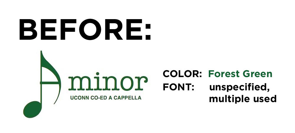
With over a decade of history behind A Minor, we recently started working on building our brand. When A Minor begun, our color was red and our logo (as designed by the late Katie Bu) became the letter "A" , creatively turned into an eighth note, followed by the word "minor".
When Katie passed, the group adopted forest green as our new color, to honor her interest in the environment.
However, there were a lot of problems with our old "brand":
- we had never decided on a font to use, ever!
- the exact shade of green was never set-in-stone.
- we never had high-res images of our logo, making it difficult to use them for printing, etc.
- many of our members found it difficult to find forest green clothes for dressing-up.
Never before has A Minor had a defined brand, with specific colors, fonts, and a high-res logo, but...
Today, we're happy to announce our new brand!
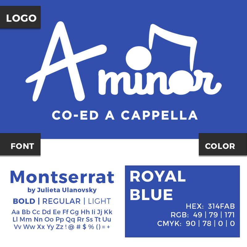
LOGO: After much careful consideration, we found it difficult to make an "A" look like an eighth note, and vice-versa. With all due respect to the logos of years' past, we decided to adopt a logo that made our "A" more prominent. The writing is handwritten for playfulness, yet clean and can be used professionally.
COLOR: We carefully chose a new color that could represent a co-ed group, without being too similar to the navy blue used by UConn or colors used by other a cappella groups at UConn.
FONT: We chose "Monserrat" for its open license and for its readability. It is very similar to the Gotham font family used by UConn, as well.
|
MINILOGO: We also developed a circular minilogo, or separate design, for use in very small sizes.
A Minor will now have a professional brand to carry it forward for another decade of peace, love, and A Minor! |

|
